Designers Recommend These Living Room Colors for a More Stylish Space
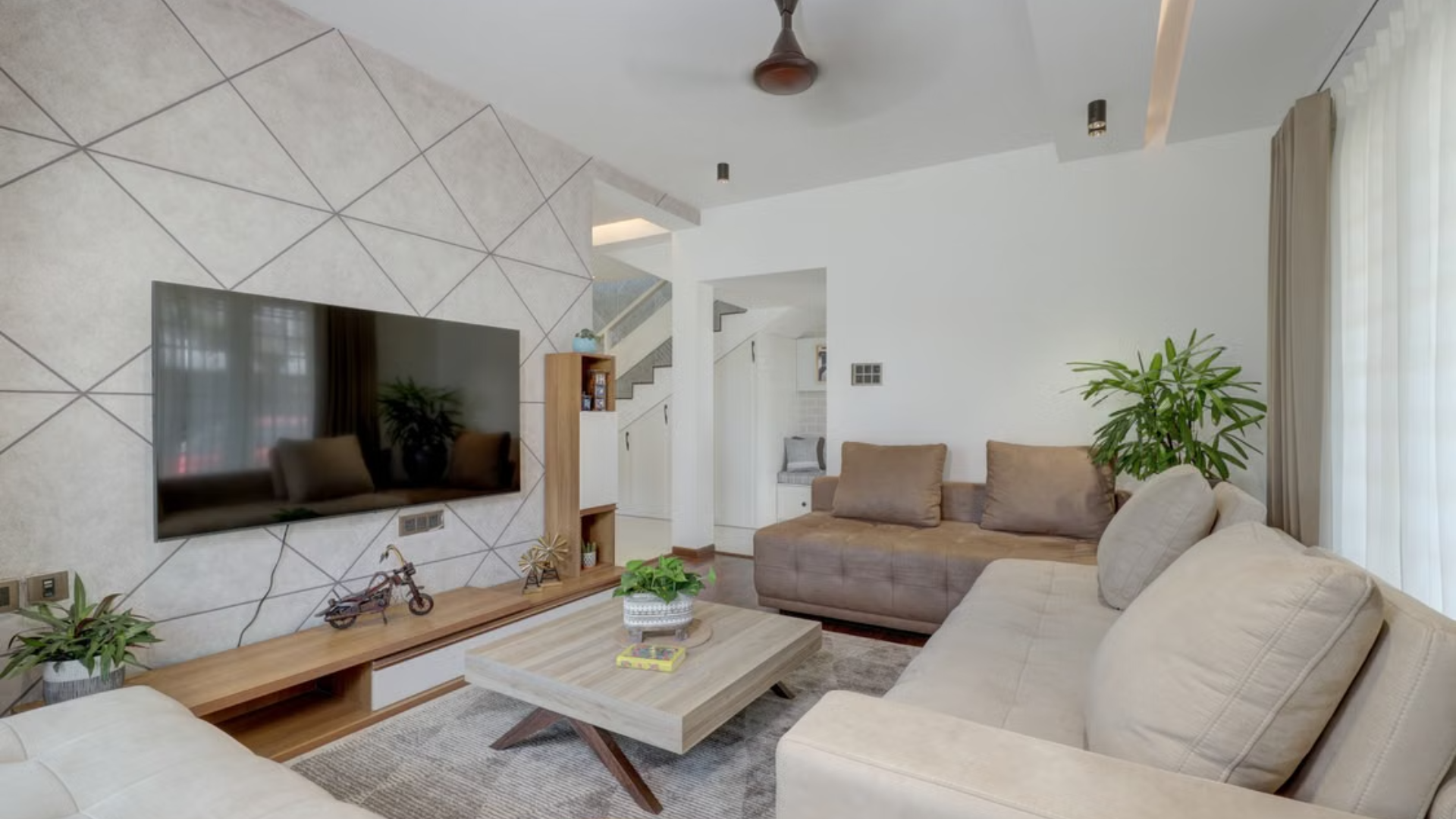

Choosing a living room paint color can have a major effect on how the entire space looks and feels. Designers say the right shade should work with the room’s natural light, furniture, artwork and overall style rather than simply following whatever color happens to be trending.
A recent Southern Living roundup featured seven paint shades that designers repeatedly turn to when creating polished living spaces. The recommendations range from soft blue and pinky taupe to several versatile whites and a gray-based neutral, showing that a stylish living room does not necessarily require a dramatic wall color.
The designers also emphasize versatility. A successful living room color should create a backdrop that supports the furnishings and artwork while remaining attractive as the light changes throughout the day, which is why several of the recommended shades have subtle undertones rather than extremely strong colors.
Soft Blues and Warm Neutrals Add Character Without Overwhelming
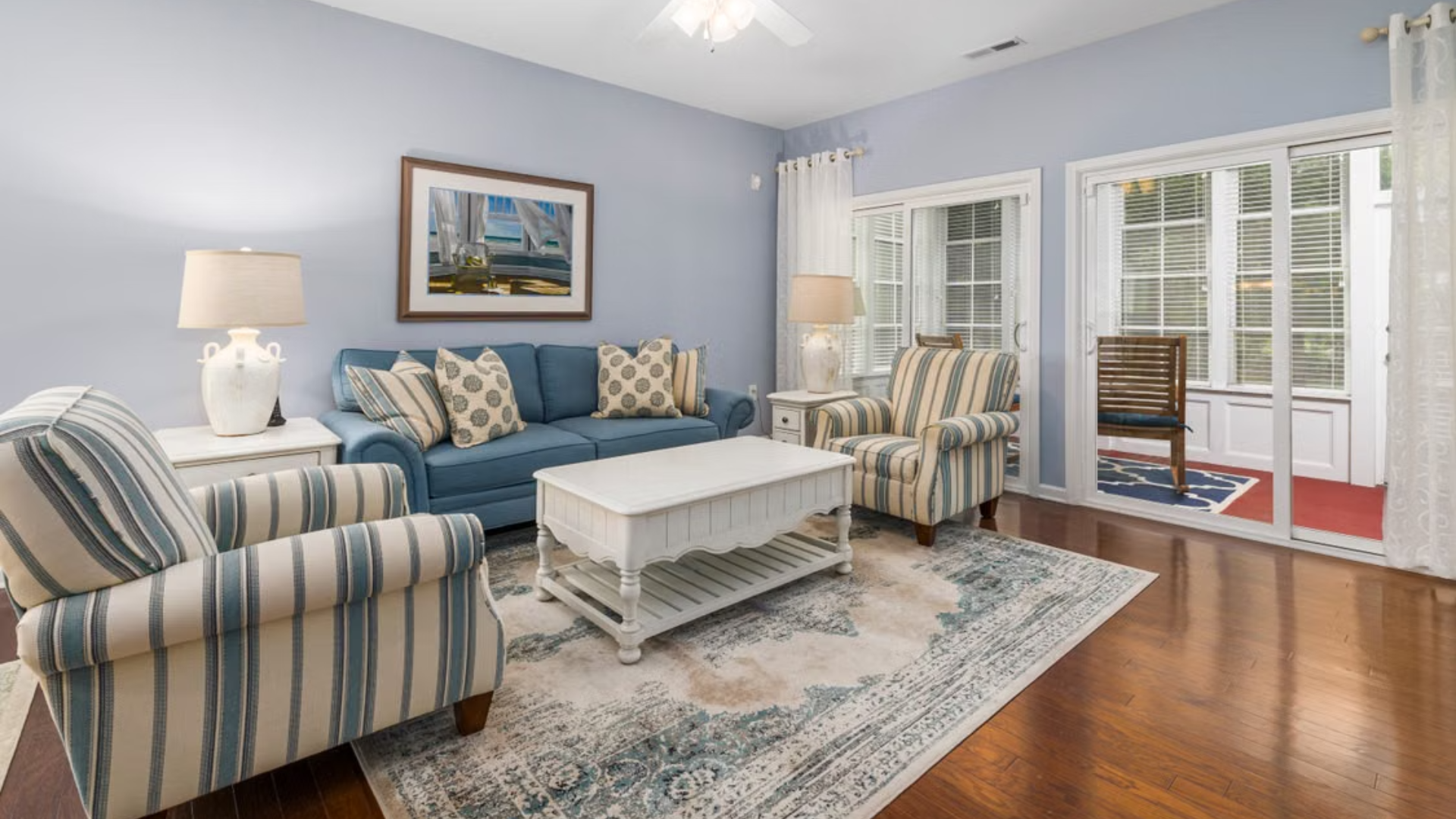
Farrow & Ball Light Blue No. 22 is one of the more colorful choices on the list. Designer Anna-Wooten Loggins says the shade can appear blue, light green or even gray depending on the lighting and surrounding furnishings, making it a particularly changeable color throughout the day. She especially likes how it works with warm brown furniture and antiques.
Farrow & Ball Dimity No. 2008 takes a much subtler approach. Designer Callie Windle describes it as a barely-there pinky taupe that creates warmth while allowing artwork and furnishings to remain the focus, making it a useful choice for homeowners who want more personality than a plain white without committing to a bold shade.
These recommendations illustrate why undertones matter when choosing paint. A color that looks completely different under morning sunlight, afternoon light and evening lamps can change the atmosphere of the room, so testing a sample in the actual space can be more useful than judging a paint chip under store lighting.
Designer-Approved Whites Offer a Flexible Backdrop
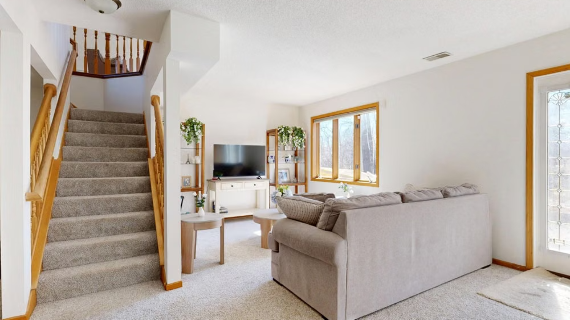
White remains a designer favorite, but the recommendations show that not all whites look the same. Benjamin Moore Glacier White OC-37 is praised by Still Johnson Interiors for being balanced enough to avoid feeling overly warm or cool, while still providing enough character to keep the walls from looking unfinished or bland.
Sherwin-Williams Shoji White SW 7042 is another designer pick, with Andrea Seymour highlighting its depth and soothing quality. She particularly likes the shade with white oak, while Benjamin Moore Swiss Coffee OC-45 offers a creamier option for homeowners who want a traditional atmosphere without the stark appearance of a bright white.
Benjamin Moore Chantilly Lace OC-65 is also recommended because it picks up natural light without producing unwanted yellow tones. For homeowners who prefer gray undertones, Benjamin Moore Balboa Mist 1549 provides another neutral option, with designer Suzanne Manlove emphasizing the importance of choosing a wall color that works with changing natural light and does not compete with artwork.
A Stylish Living Room Starts With How the Color Works in the Space
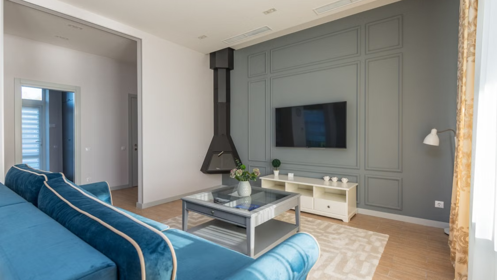
The designer recommendations make clear that there is no single universally perfect living room paint color. Light Blue can introduce subtle color, Dimity can add warmth, and the various white shades can create a flexible foundation, while Balboa Mist offers a more gray-based neutral for spaces where homeowners want a softer, understated backdrop.
Before committing to a shade, homeowners should consider how much natural light enters the room, which direction the windows face and what colors are already present in the furniture, flooring, curtains and artwork. The same paint can look noticeably different depending on its surroundings, which is one reason designers pay close attention to how colors evolve throughout the day.
Ultimately, the most stylish choice may be the shade that makes everything else in the room work better together. Whether that means a barely-there taupe, a changeable blue or a carefully chosen warm white, these designer-approved colors offer practical ways to refresh a living room without relying on a fleeting trend.