Why buy Nike when you can have “Mike”? Who needs Gucci when “Guluosi” has got you covered? The world of knockoff brands is a treasure trove of unintentional comedy, where trademark lawyers weep and bargain-hunters rejoice. Buckle up for a laugh-out-loud journey through the funniest and fakest knockoffs the internet has gifted us.
Pringles in Another Universe?
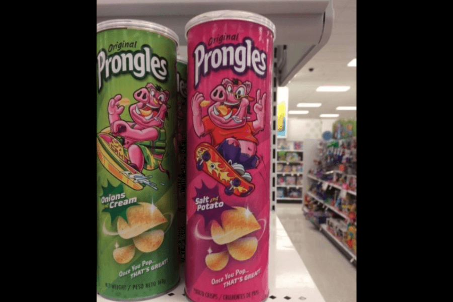
No, you’re not experiencing the Mandela Effect. This is also not a glitch in the matrix or a multiverse of madness either! You see a variant of Pringles, but we’ll call it… PRONGLES!
You might be wondering if they taste the same. Well, they could be, but we highly doubt if Pringles would like to share their secret ingredients with their long-lost sibling.
I mean, you can’t afford to lose this time. Look at Prongles, with its pig mascot riding on a skateboard, looking so determined to create its own name (pun intended) at the grocery aisles!
There’s No Dr Pepper in the House, Only Dr Perky!
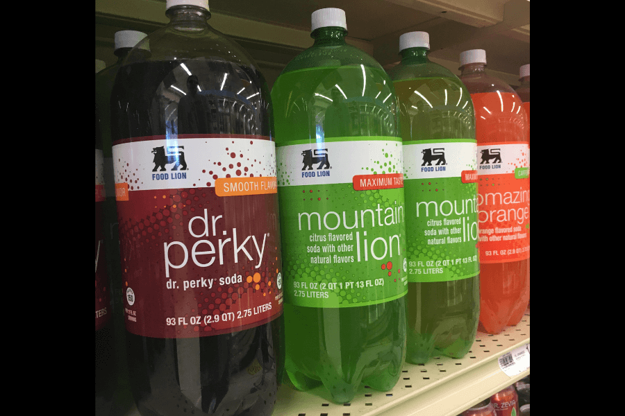
Gotcha! We know you’ve blinked twice for this, and you’re definitely not wrong! You might think, “Isn’t it supposed to be Dr Pepper, or am I tripping?”
Say goodbye to Dr Pepper because another doctor is in! Are you looking for a smooth flavor that Dr Pepper, perhaps, cannot provide? Call the doctor… not Pepper but Dr Perky!
Fancy another flavor? They also have a Mountain Lion! Yes, Lion, not Dew. What’s Mountain Dew anyway? We haven’t heard of it. Mountain Lion sounds more legit!
Adidaa
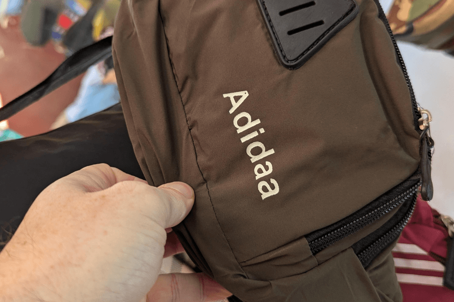
Typographical error or not? To be fair, the letters A and S are just beside each other. Whoever typed this one, maybe he doesn’t realize that he created a knockoff brand!
That’s so close! It could’ve been Adidas if they were careful enough. Maybe they still wanted to be unique and apart from the real one. Who doesn’t like to be the rarest of all anyway?
In a world full of Adidas, be Adidaa. You think you’re a mistake? No, you’re just a whole new identity; it was like being born again. All we need is a little bit of creativity.
That’s Wild, Son!

Well, if it bounces… then it’s still a ball. Isn’t it? Do you really need Wilson if you have Wildsun at the department store? Be for real!
Just think of Wildsun as the perfect epitome of the “Hey, let me copy your assignment, but I won’t make it obvious” meme circulating online. Did it successfully convince you? Nope?
But honestly, it did so well in copying Wilson’s sporty font and taking a look at the promise of Maximum Performance (because apparently, anything less would be unacceptable)!
Tcc Tcc
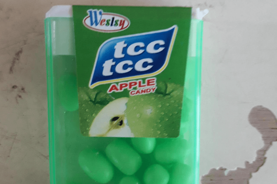
Everyone’s so familiar with this. It’s everyone’s favorite breath freshener! Meet Tic Tac, no… sorry. Again. Meet tcc tcc! We don’t know how to pronounce that seriously, but we get where it’s coming from.
The resemblance to Tic Tac is not just uncanny—it’s intentional. Look at the logo: the rounded, blue bubble behind the white text is a clear nod (or blatant copy) of the original Tic Tac design!
That transparent plastic box filled with tiny, green, pill-shaped candies screams, “We’re not copying—just heavily inspired!” Yet, admit it. It almost got you FOOLED.
Because Sony’s Overrated

Is it another typographical issue, or is this knockoff truly living up to its name? We’re setting the house rule: nobody knows Sony, we only have Fony!
The controller itself is designed to look like Sony’s famous DualShock3, but we don’t think its point is to fool us. It feels more like they’re saying, “It’s fake, but just go with it.”
Who could ignore the choice of name, though? It’s a not-so-subtle pun on “phony,” and because of that, no one could practically accuse the creators of false advertising because they’re practically shouting, “Yes, it’s fake!”
KPC
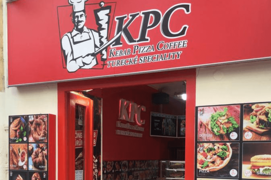
The day has come that we swap Colonel Sanders for a kebab-wielding chef and fried chicken for a mashup of kebabs, pizzas, and Turkish specialties. Bring your family here at KPC!
Honestly, this is an almost-too-perfect riff on KFC, right down to the red-and-white palette and prominently featured mascot. But instead of the Colonel, we get a cheerful chef proudly brandishing a kebab meat skewer.
But the similarities don’t stop there! Even the interior styling—with its clean white tiles and bright red accents—feels like a tribute to fast-food royalty. Except… it’s Turkish specialties.
Hungry? Grab a Sniper!

Hey, hey, hey. Not the gun, buddy. The chocolate! Take this little wrapper of chocolatey goodness and eat it whenever you’re hungry. At least that’s what Snickers, I mean Snipers, had told us!
Does it feel like the name Snipers belongs more in an action movie, not in a candy aisle? Imagine walking at a grocery store, and you saw the slogan, “Hungry? Grab a Sniper!” EVERYONE, RUN!
And seriously, who would dare to name their candies Snipers? Are we supposed to associate it with precision and accuracy? Is it meant to “take out” hunger with deadly efficiency? And… wait! Who’s Pepe?
The Ultimate Knockoff Crossover

Ah, why choose when we can have both brands in one t-shirt? This is When Harry Met Sally, but make it When Ralph Lauren Met Lacoste.
It’s literally breaking the formula of what was supposed to be considered a perfect knockoff! Usually, knockoffs aim to mimic one specific brand, and you haven’t seen anything quite like it!
On the left, we’ve got Lacoste’s unmistakable crocodile, and on the right, we have the polo player from Ralph Lauren. Together, they create the fashion equivalent of a cinematic crossover that absolutely nobody asked for.
PitaHut

No one outpizzas the hut, but PitaHut certainly can! Just kidding, it really can’t because it’s serving pitas, not pizzas. You don’t see pepperonis and cheesy cuts here!
It’s a name that feels both familiar and confusing, but it’s hard to miss its resemblance to Pizza Hut. The font, the roof icon above the “Hut,” and the overall branding aesthetic? Not so original!
Is it just me, but the restaurant feels like it’s trying to convince you that it’s part of the same franchise family, and only it has a Mediterranean twist? We need answers, Pizza Hut.
Dbapdool and Wolvbrlne

This is me when I’m drunk texting someone at midnight. I type most of the letters wrong, and I probably don’t care because I know you’d know I’m talking about Deadpool and Wolverine!
Take a sound check on the spelling. Do you think it’s clever to avoid jail time? “Yeah, we cannot sue them at all, man. They called their superheroes Dbapdool and WolvbrIne!” said the Marvel creatives.
Pure chaos marketing, and honestly, does it kind of work? People will buy this for fun, and in the future, they will tell kids, “You would never get this rare Dbapdool and WolvbrIne collectibles today!”
ChadGPT

In the ever-expanding world of AI, tech giants like OpenAI are leading the charge with groundbreaking assistants like ChatGPT, along with ChadGPT. Yes, ChadGPT!
If you don’t like double-checking your links, you might probably get directed to this site. You’d be surprised you’re not talking to an AI, but… what we call “Chads” instead.
The internet thinks these Chads are stereotypical alpha males, successful in their own rights, but sometimes can get real… cocky. So, if you wanna talk to them, ChatGPT isn’t for you, ChadGPT is!
Penesamig
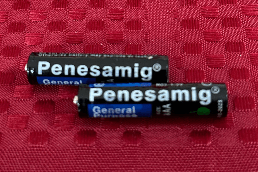
We’ve tried not to laugh at this knockoff, but the more we try it, the harder it is to stop ourselves from laughing! Penesamig, how humorous could you get? Seems unreal, but it is true!
Who created this, and did they say it out loud before printing it? I doubt if they were able to keep a straight face! Panasonic, you’ll never make us guffaw like Penesamig!
Will Penesamig keep your TV remote running for months? Or will it sputter out after a single channel change? Who cares! No batteries can make us laugh so hard except for Penesamig.
Rank Them From Strongest to Weakest
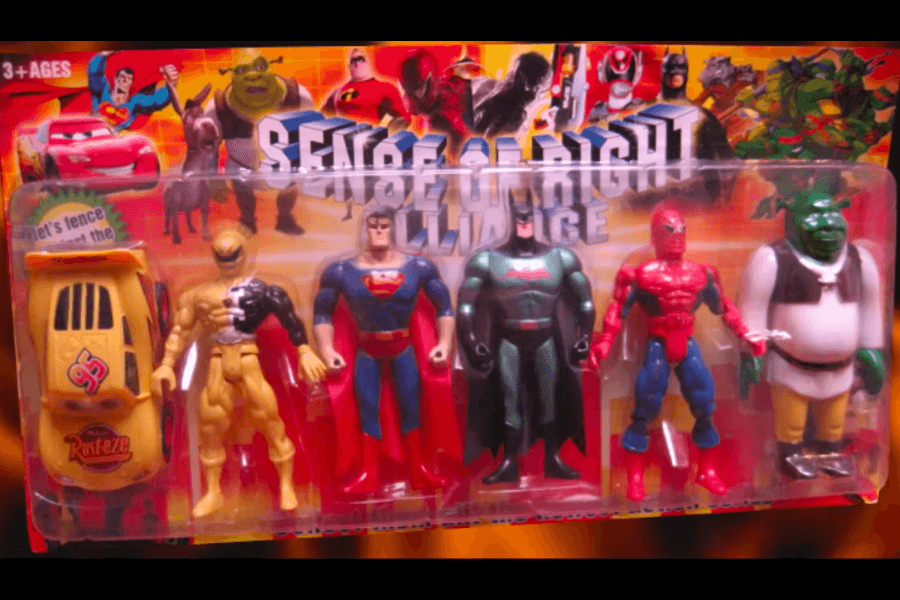
If you ever thought Avengers: Endgame was the peak of crossovers, think again. Feast your eyes on the Sense of Right Alliance! This lineup… geez, it defies logic and reason!
Who would think Superman, Batman, and Spiderman would get along with… Shrek (Yes, Shrek!) and (we’re not sure with this one) Cruz Ramirez in saving the world from Joker and Lex Luthor?
When you think of an elite superhero team, do you obviously include a swamp-dwelling ogre and a car? HELP. The name itself, Sense of Right Alliance, feels like a last-minute attempt to sound heroic.
Not Until You Look At It Closely

At first glance, the branding on these socks looks eerily similar to H&M, one of the most recognizable names in affordable fashion. The simple logo, the clean packaging—it’s all there.
But upon closer inspection, you realize, “Wait, this isn’t H&M; it’s HaM!” They got us fooled! My blurry eyes would simply fall for this tactic even if I wore my glasses on.
They said imitation is the sincerest form of flattery, and these HaM socks are writing love letters to H&M. It’s actively trying to pass itself off as the real deal.
Ghlain Klain
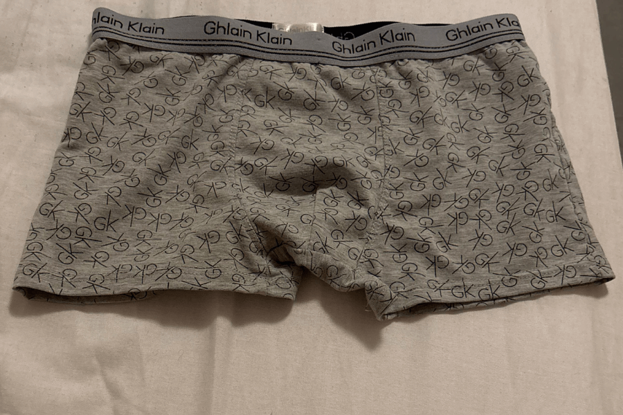
Ever wanted to combine affordability with unintentional comedy? Well, chief, this is the underwear for you! Some barely try to hide their inspiration, but Ghlain Klain said, “Nope!”
I just wanna get this out of my chest. Whenever I try to read the name Ghlain Klain, my mind reads it as Genghis Khan! Any chance these two are related somehow?
But anyway, the similarities between Ghlain Klein and Calvin Klein are hilariously obvious. The logo on the waistband, the sleek font, and even the initials scattered across the fabric (GK instead of CK)!
Because Even Dave Deserves a Beauty Cream Bar
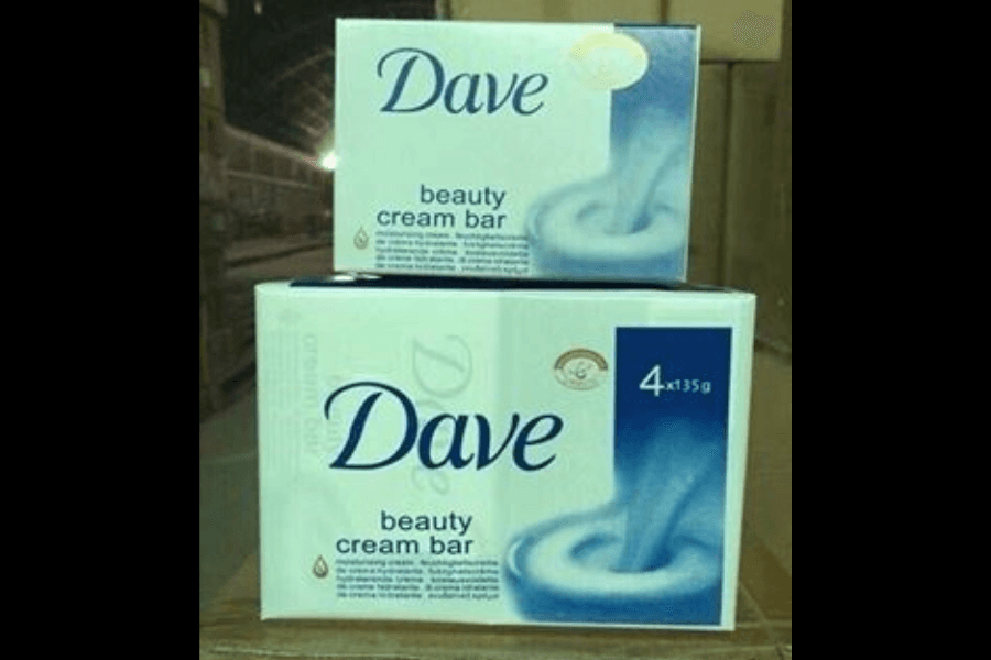
“Hey, what’s your favorite soap?” “Oh, I love Dove! It makes my skin soft. What’s yours?” “Mine’s Dave!” “Excuse me, what?” That’s how I imagine conversations with Dave lovers.
Are they serious? Or did they come from a fantasy world where the bird becomes human? Forget purity and nature; we get Dave—a name that sounds more like the guy fixing your Wi-Fi.
From the packaging to the font, Dave is undeniably Dove’s cheeky doppelgänger! The blue and white design, the graceful logo, and the promise of a “beauty cream bar” all scream Dove.
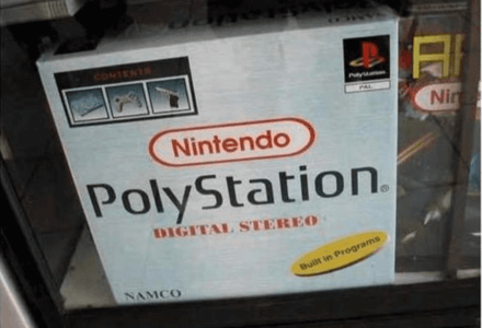
Nintendo and PlayStation Deciding to Collaborate… Sort Of?
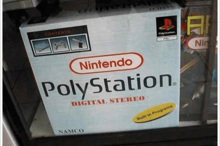
PlayStation. PolyStation. Police Station. Yeah, it sounds more similar to Police Station, and if PolyStation doesn’t stop plagiarizing… well, they are surely gonna end up in the police station, indeed!
They really had the nerve to collaborate with two competitors, huh? Nintendo and PlayStation inexplicably share the same box. Wow, this is the ultimate “why choose?” gaming experience.
However, we think this one is blatant intellectual property theft. They used Nintendo’s iconic logo, then slapped the PlayStation name on it, and even included the Sony-esque logo in the top-right corner of the packaging!
Breaking Off a Piece of KatKot
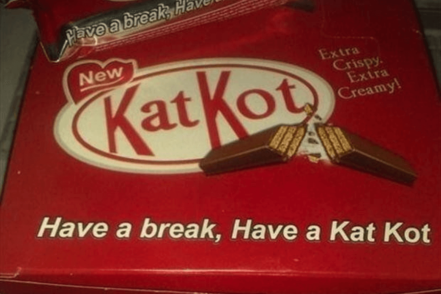
Have a break, have a… KatKot? CRINGE. WE’RE SERIOUSLY CRINGING RIGHT NOW. The name sounds like it was generated during a Mad Libs game!
While it is true that it’s not trying to be a seamless copy of KitKat, it veers into hilariously awkward territory with a name that’s just… baffling.
Is this an alternate reality where KitKat just couldn’t get its act together? They painfully hijacked the iconic slogan of KitKat; I wonder if KatKot’s marketing team high-fived themselves for this “brilliant” idea?
Your Friendly 7-Eleven Neighborhood
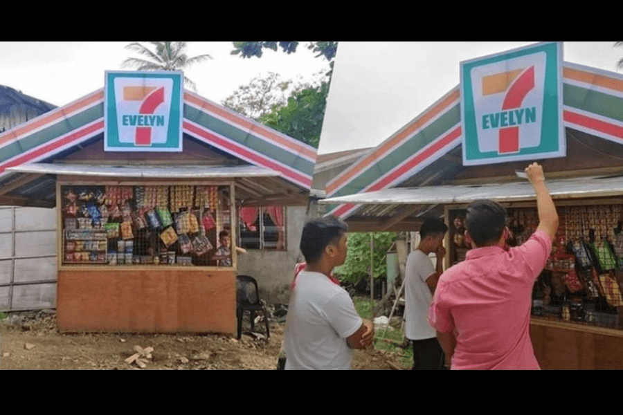
It’s the kind of knockoff that makes you smile because it doesn’t feel like theft. You can almost picture Evelyn herself deciding one day, “You know what? I am the 7-Eleven of this town!”
Who needs a global corporation when Evelyn is here to save the day? We’ve heard 7-Eleven asked them to change this design, but isn’t it obvious that 7 Evelyn doesn’t want to be 7-Eleven?
It’s just for the sake of humor. Imagine walking into 7 Evelyn expecting Slurpees and hot dogs, only to find locally made snacks, sodas, and perhaps a friendly Evelyn at the counter.
Gucci’s Long-Lost Twin…

And if you still don’t have it, you better add it to your cart… now. Why spend thousands on Gucci when you can have Guluosi for a fraction of the price?
These were the “designer” bags you’d find on vacation, lovingly displayed on folding tables at bustling markets. They were treasures you’d proudly show off to friends and make them guess if it’s Gucci or not.
Would you carry a Guluosi bag? It doesn’t look bad at all, right? Yes, it’s not an authentic Gucci bag, but somehow, it’s practical for people who cannot afford luxury brands!
Poopsi
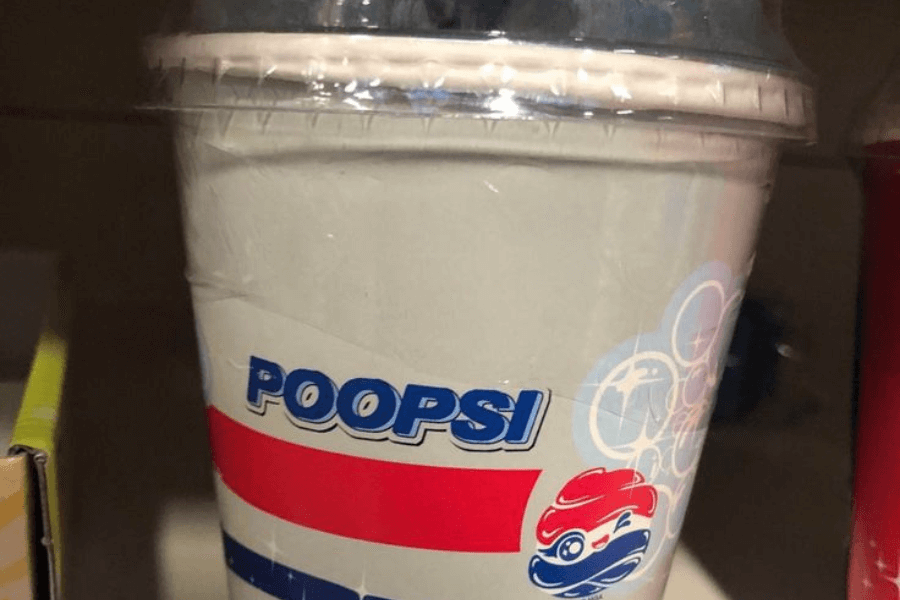
I doubt if you can say “Poopsi” out loud without even cracking a smile or picturing a cola with some seriously bad branding luck despite the logo looking very cute with its wink and sparkle!
We imagine the conversation in the boardroom like this: “We need a name that’s close to Pepsi but still different. Any ideas?” And someone raised their hand and said, “Poopsi!” and for them, it’s life-changing.
Quench your thirst… if you dare with this one. Who knows, you’ll get the taste of the iconic Pepsi cola or the taste of po—? Nope, nope. We’re not signing up for that.
Close Enough?

Detos takes the crown for being blatantly obvious. Straightly mimicking Doritos just enough to fool you into grabbing a bag when you’re not paying attention! I’d fall for it, honestly.
They literally kept everything close to the more popular one, Doritos, while avoiding legal trouble. The red packaging, the bold white font, and even the triangular chips! COPIED.
The taste is probably not going to match Doritos. But that’s not why you buy Detos. You buy them for the laughs or maybe… you want something to share on Reddit? Laughs.
Ghanel Paris
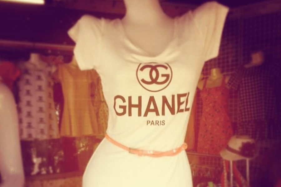
Yeah, we know it’s fake, but isn’t it fabulous, though? It’s still a dress you can wear if you want to go to a party where showing off luxury brands was never a priority!
Maybe it only wants to borrow the elegance of a high-end fashion house, Chanel? After all, if this is the last piece of clothing you can find in this world, you’d still wear this, too!
Also, the addition of “Paris” beneath the name is genius because nothing screams luxury quite like associating your product with the City of Light—even if it was likely manufactured in a much humbler location.
Dolce & Banana

“I think I’m in the mood to wear Dolce & Banana today.” “You mean… Dolce & Gabbana?” “No, it’s Dolce & Banana.” and everyone will look at you as if you’re kidding.
But the minion-nation will surely cheer for you! At least, there… Dolce & Banana sounds pretty legit, and it is not only an illusion of high fashion! Ever considered moving? Joke!
Sometimes, we just have to take a step outside the seriousness of high fashion and appreciate high comedy instead. We all need breaks from fulfilling societal expectations or, better, not fulfilling them at all.
One Nirvana
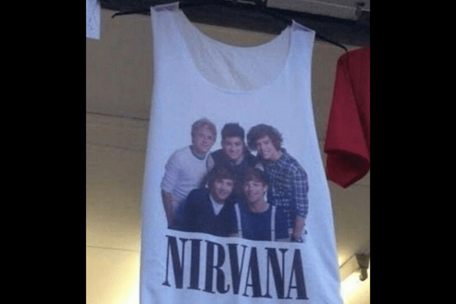
Baby, you light up my world like a teen spirit! One Nirvana announces that their t-shirts are officially SOLD OUT! Fans are going crazy because they need to buy more in different colors!
That’s the kind of news we’ll be hearing if we exist in the world of One Nirvana, the world where pop band One Direction is in collaboration with grunge rock band Nirvana!
We can only dream of this collaboration happening in the universe we belong to right now. Though honestly, it’s a mashup that no one asked for. But seeing this top? What if it happened?
Harry Potter and the Transformers
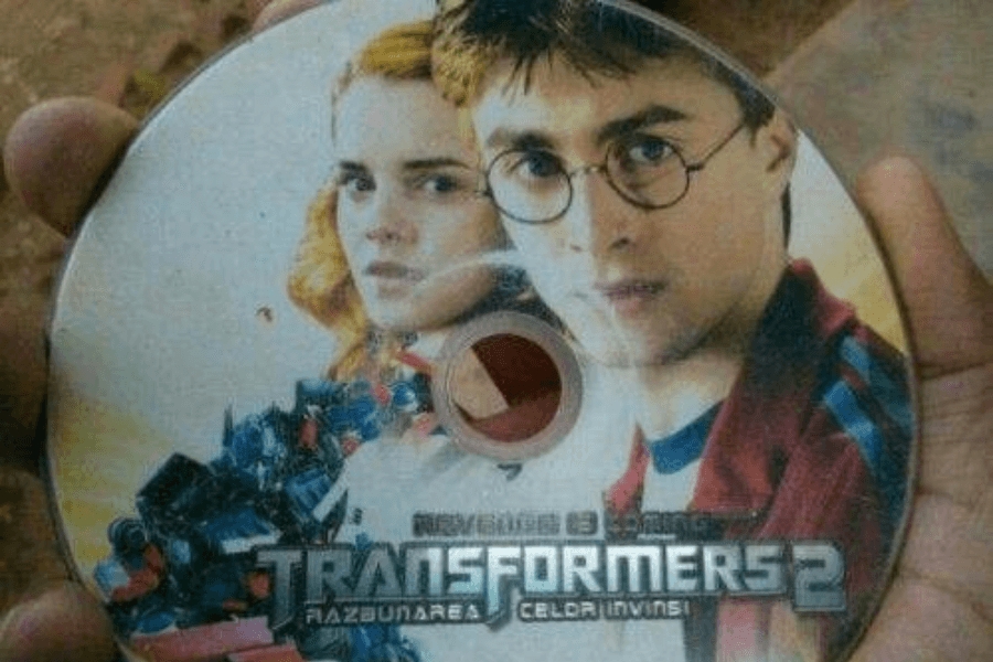
Who says Transformers 2 doesn’t need a touch of wizardry? Boo, you’re wrong! See this DVD we’ve got. You see Harry and Hermione hanging out with Optimus Prime!
Oh, the tagline got us rolling on the floor laughing! “Revenge of the Celor Invinsi.” It’s likely a mistranslation of Transformers: Revenge of the Fallen. What does it even mean? Is it Romanian? A spell?
These were the DVDs you’d buy for a few bucks, only to find out the movie inside wasn’t Transformers 2 or worse—the right movie but dubbed in a language you didn’t understand.
Mortal Kumbia

Move over, Mortal Kombat—there’s a new game in town, and it’s ready to hit all the wrong notes. We can almost hear the cumbia music blaring from the case.
Combining deadly fighters with…a keyboard? Mortal Kumbia, the game that you are! It’s like a game that musicians could play if they want to experience how to be Scorpion for a day.
What do you think the developers were thinking? What if, instead of finishing moves, the fighters formed a dance band? Scorpion right here has traded his fatalities for synths!
Setting the Bar Low for Hair Care, It’s Just Okay
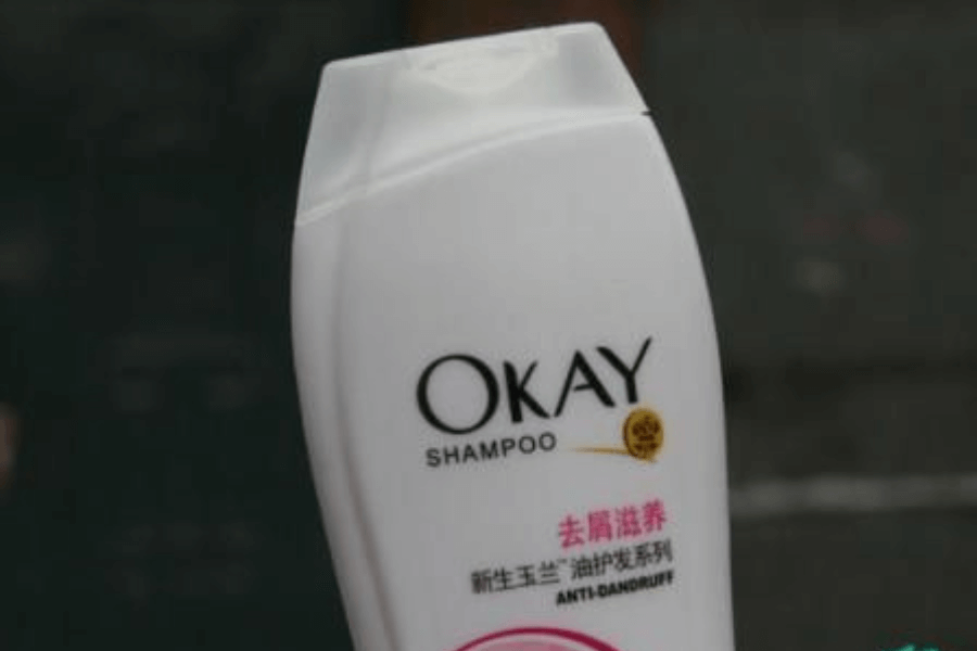
When it comes to hair care products, branding is everything. You want your shampoo to exude confidence, luxury, and promises of silky, shiny hair. But OKAY Shampoo?
Well, it’s honest. It’s not great. It’s not amazing. It’s just… okay. We’re not complaining, really. We thank you for your honesty, okay? (We love this punchline.)
Anyway, we know at first glance Okay seems suspiciously familiar to you. So, yes, we’re confirming it. It’s trying to channel the elegance of Olay or maybe Pantene!
Legs Chips

Of course, the name doesn’t define what’s inside! You’re not getting chips in leg form here, or else that would be so… weird? Who would like that?! Eyeing you suspiciously.
“We’re trying really hard to be Lay’s.” but the only difference was the name. Instead of “Lay’s,” we get “Legs,” and the longer you stare at it… it gets stranger.
Come on, it’s impossible to look at Legs without immediately thinking of Lay’s. From the red and yellow packaging to the crisp imagery of wavy potato chips!
The Cleaner That’s Almost a Household Name

“Okay, stop! We cannot go a little further. Design is very Tide, the colors, the font, everything. One thing’s left. The name. Make it Tids instead?” And everyone agreed, whoever thought about that.
Just let humans feel that they’re holding the real deal through the packaging, said probably by the creators. And imagine trying to recommend this detergent to a friend…
“Oh, I use Tids. You know, like Tide but… not.” Then, the awkward laughter and conversation begin. Does Tids clean your clothes as effectively as Tide, or does it leave them smelling like regret?
The Chill Knockoff We Didn’t Know We Needed
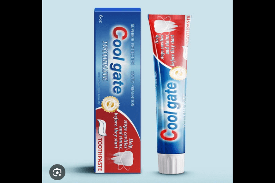
Step aside, Colgate—you’re out because there’s a new brand in town, and it’s as cool as a snowstorm in the Arctic. Ever heard of Cool Gate’s existence? No? So, now you know!
But seriously, everything about this tube is “Colgate wannabe.” From the color scheme (red, white, and blue) to the sleek lettering. Then, the name. Nothing says “oral hygiene” like a gateway to… coolness!
You could pick this from the toothpaste aisle and wonder, “Wait, I was very sure I took Colgate, not Cool Gate. What in the magic is this?”
Let It Go… Somewhere Else
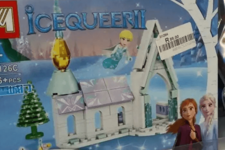
If you thought the Frozen craze was wild, brace yourself for IceQueerII, the knockoff that takes Elsa and Anna’s magical story and turns it into something completely… queer?
No, we’re not serious about that. There’s nothing queer about this knockoff, and we don’t know why they named it IceQueer in the first place! But this one’s obviously riffing off Frozen II!
The building blocks even mimic Lego’s famous style, but instead of a timeless brand name, we get something that sounds like it was pulled out of a random name generator that had a bad day.
Just Don’t Do It

Nike? That’s too obvious. Let’s make it relatable! And thus, Mike was born. One letter. That’s all it took to go from a sportswear titan to a guy who might sell you a used lawnmower!
The design isn’t even trying to hide its inspiration. The swoosh is there. The bold font is there. And then there’s the question of branding. What is Mike’s slogan? “Just do… something?” “Why not?”
Some argue that it must’ve been a typo. Whether it’s a typo, a deliberate knockoff, or the start of an entirely new fitness empire, one thing is for sure: Mike just did it.
The Fast and the Fabricated
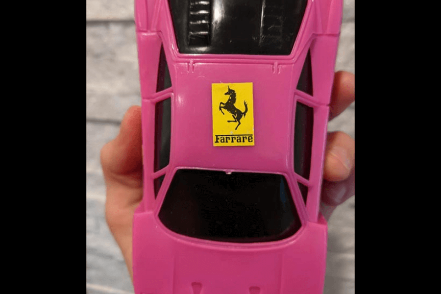
As a huge fan of F1 Racing, I’m pretty sure I haven’t seen Farrare cars at the racetracks. Is this the one who can beat Red Bull in their winning streaks? (Watch out, Max Verstappen!)
Ferrari represents speed, power, and precision. While Farrare represents… whatever was lying around in the toy factory that day. Also, it’s budget-friendly—most importantly! You can buy it anytime you want.
For anyone who grew up with knockoff toys, you know that these were the cars you’d find at local markets or discount stores, often bought by well-meaning relatives who just wanted to see you smile!
Where Your Hair Gets the Royal Treatment
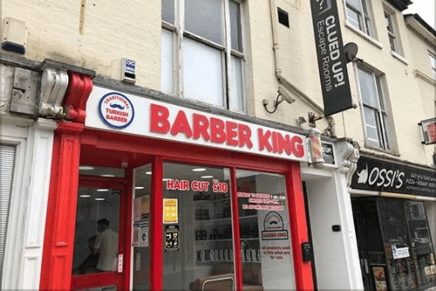
Who’s currently craving for burgers? You? Well, call Burger King now! But if you’re craving something different like a… haircut… say no more, love! BARBER KING IS RIGHT ON YOUR STREET!
The owner was definitely feeling silly and decided to borrow that flame-grilled glory for haircuts instead of hamburgers. The only thing missing from the visuals is the promise of a Whopper!
Say goodbye to aromatics, patties, and grease! Get ready to look fresh and clean. It’s the kind of place you go not just for a haircut but for the story you’ll tell afterward.
For When You Want the Look, Not the Smoke
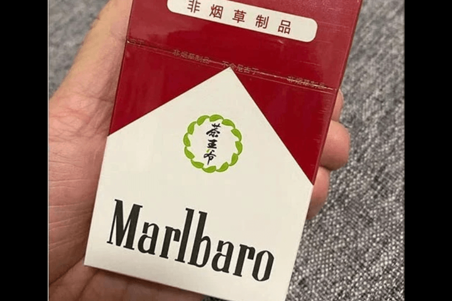
You might think this is a pack of the iconic Marlboro cigarettes. But look closer, and you’ll see the name has taken a slight detour. Marlbaro is not quite the cigarette you’ve been expecting!
What’s actually inside this pack? Is it cigarettes, tea leaves, or something else entirely? Well, we’ve translated the Chinese texts for you! Perhaps they only want the look of iconic Marlboro, not the smoke!
It says “non-tobacco products” at the top, and the circle translates: tea prince. You get the idea now! “Wanna have some tea? I’ve got Marlbaro here.” “Isn’t it a cigarette?” “You’re not gonna believe this.”
The TV That Hugs Your Budget Tight
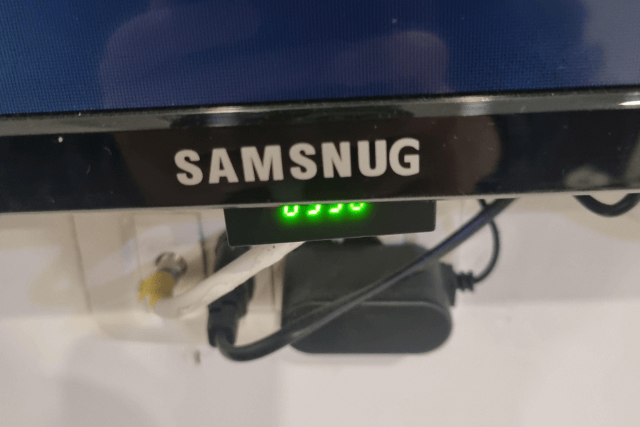
Regarding home electronics, Samsnug is the gold standard of sleek design, advanced technology, and trusted performance. (Hey, you might want to check the spelling.) Samsung, I mean.
The logo is hilariously close! Is it a typo or a marketing ploy? Either way, it’s clear the creators of Samsnug wanted you to glance at this and think, “Hey, that’s a Samsung!”
Is this TV designed to provide superior picture quality, or is its sole purpose to keep your living room feeling snug? Will it last a week? A year? We better get one now.
Sportswear Meets Seafood

If you thought PUMA was the pinnacle of athletic branding, think again—because TUNA is here to take the crown. Yes, this knockoff tank top replaces the sleek, leaping feline of PUMA with… a fish!
Wait, folks… it’s not just a fish but a TUNA! Not bad, though. Tunas are very expensive. If you’re on a strict budget, you can only crave it.
Honestly, the tuna looks like it has no idea how it got there. “They just printed me here. Get me back to the waters!” Poor Tuna. You become a sportswear inspiration.
The Unofficial Cousin of Bounty Bars
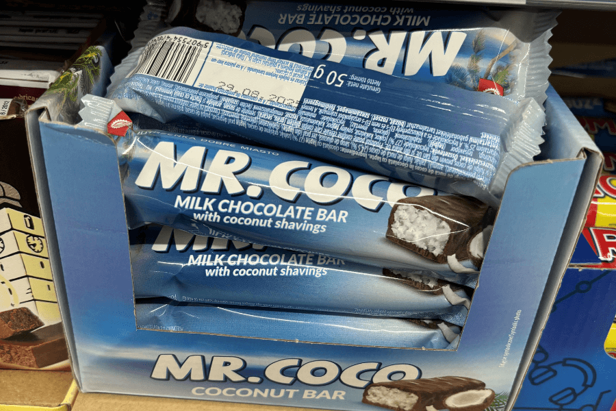
Whenever I get the chance to encounter Bountybars, I always see complaints and hate rather than praise. If there’s an award for the most hated chocolate, this is our top nominee!
So, Mr. Coco, are you really sure you want to continue the broken legacy of Bounty bars? Can you offer a more refined taste than just desiccated coconut filling?
Even the tagline, “Milk chocolate bar with coconut shavings,” is trying its best to sound classy. Please ensure the coconut taste and chocolate balance each other this time.
Pibe 10, The Ice Cream Hero
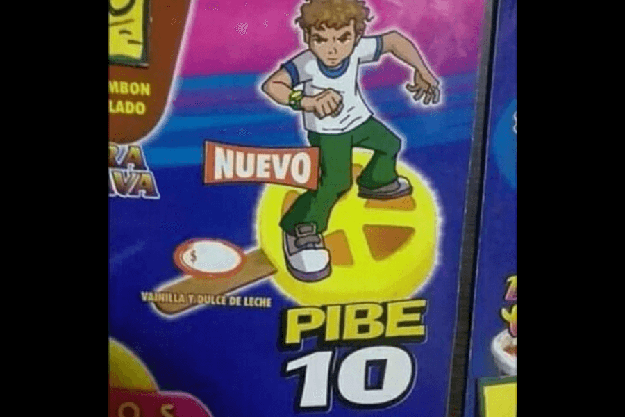
Oh, this is sacrilegious! What did you do to our boy Benjamin Tennyson with aliens inside his Omnitrix? Is this a knockoff about soccer? Skating? Being a kid? Where’s Gwen?
Some argued that it was inspired by an Argentine footballer, Diego Maradona, famously nicknamed “El Pibe de Oro” (The Golden Kid), and we get the confusion now.
The cartoon character doesn’t look like Ben 10; however, we see Cartoon Network’s influence in the design. But instead of fighting monsters and aliens, he’s promoting… vanilla and dulce de leche ice cream.
Nutella’s Cousin Twice Removed
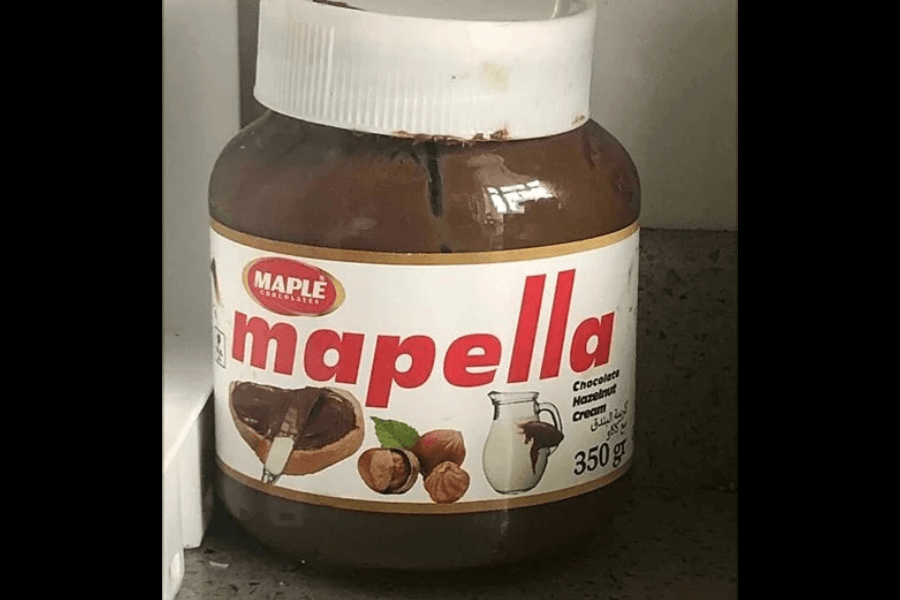
“Mom, I want Nutella!” “Honey, we have Nutella at home.” And when they got home, the lovely kid saw Mapella at their dining table, standing proudly and… humbly.
It’s like Nutella had a younger sibling who decided to take a different career path. Did they think no one would notice if they just changed a few letters? Spoiler: we noticed!
Where does maple come into play here? Are we supposed to believe this spread is flavored with maple syrup, or is it a sneaky attempt to sound distinct while staying in Nutella’s lane?
The McDonald’s of the Neighborhood

Have you ever heard that there’s a new culinary mogul in town? You think it’s just another McDonald’s branch? You’re wrong this time, pal!
You gotta meet Mr. Mahmoud! But don’t expect Big Macs and Happy Meals here. I know, I know. They’re clearly channeling McDonald’s, but trust me—they’re different.
Tell me, have you ever tried ordering a pizza at McDonald’s? Nope? Then, that’s why Mr. Mahmoud’s here! Quarter Pounder, who? Have a greasy and cheesy pizza slice!
Chewbacca Goes on Safari

Ladies and gentlemen, I present to you That Lion Thing. No, it’s not a typo or autocorrection. You assumed it’s The Lion King, no? We’ve disappointed you; I know.
Against a starry backdrop that screams Star Wars, we’re gifted with the most “artistic” rendition of the character Chewfasa. Yeah, why would we lie about the name? They called him Chewfasa. Help.
Why not call it “Space Cat” or “Intergalactic Mane Man” instead? Ah, of course, it doesn’t sound as creative as Chewfasa. It’s not roaring; it’s silently pleading, “Please hide me back to the warehouse.”
Superman, but with a Twist of Hanuman
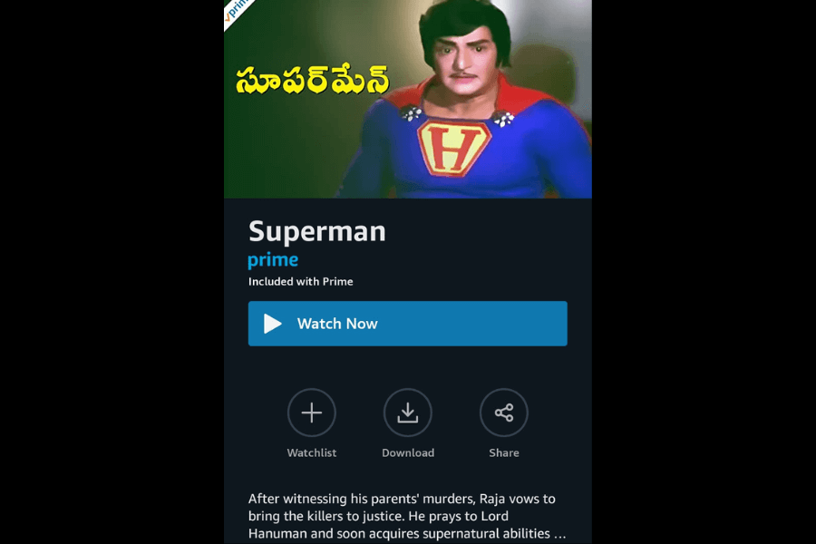
A version of Superman that is straight from the land of spicy curries and masala storytelling. You’re expecting to hear Clark Kent’s story, but why do we think it’s more of… Bruce Wayne’s?
What’s that big “H” on his chest? Is it for Hanuman? Hero? Hope? All of the above! Even though he’s not the Kryptonian hero we know and love, gotta admit his mustache is perfect.
The mustache was his version of the S-curl! But let’s not overlook the absurdity of the plot. Superman usually fights aliens, supervillains, and the occasional robot uprising. This Superman goes after petty criminals!